The Kami house in Petaling Jaya stands out with its pitched roof design. Photos: Bricksbegin
It did not take long for husband and wife Winston Zane See and Amy Ang to agree on the design of their new home for their family of five in Petaling Jaya, Selangor.
They had very similar ideas, so working out the details of remodelling a double-storey end lot was a breeze, especially since both of them are architectural designers.
“The planning process was pretty short as my wife and I were aligned with the direction (not always the case in other regards!). It took us about one month to get all the designs finalised, and another couple of months for the authorities’ approval,” said See.
The end result is a pleasant, pitched-roof design with an open-plan layout, a central courtyard, a home office and a cactus garden to boot.
“We wanted an open-plan layout not just for the spatial experience, but also to always have our eyes on the kids.
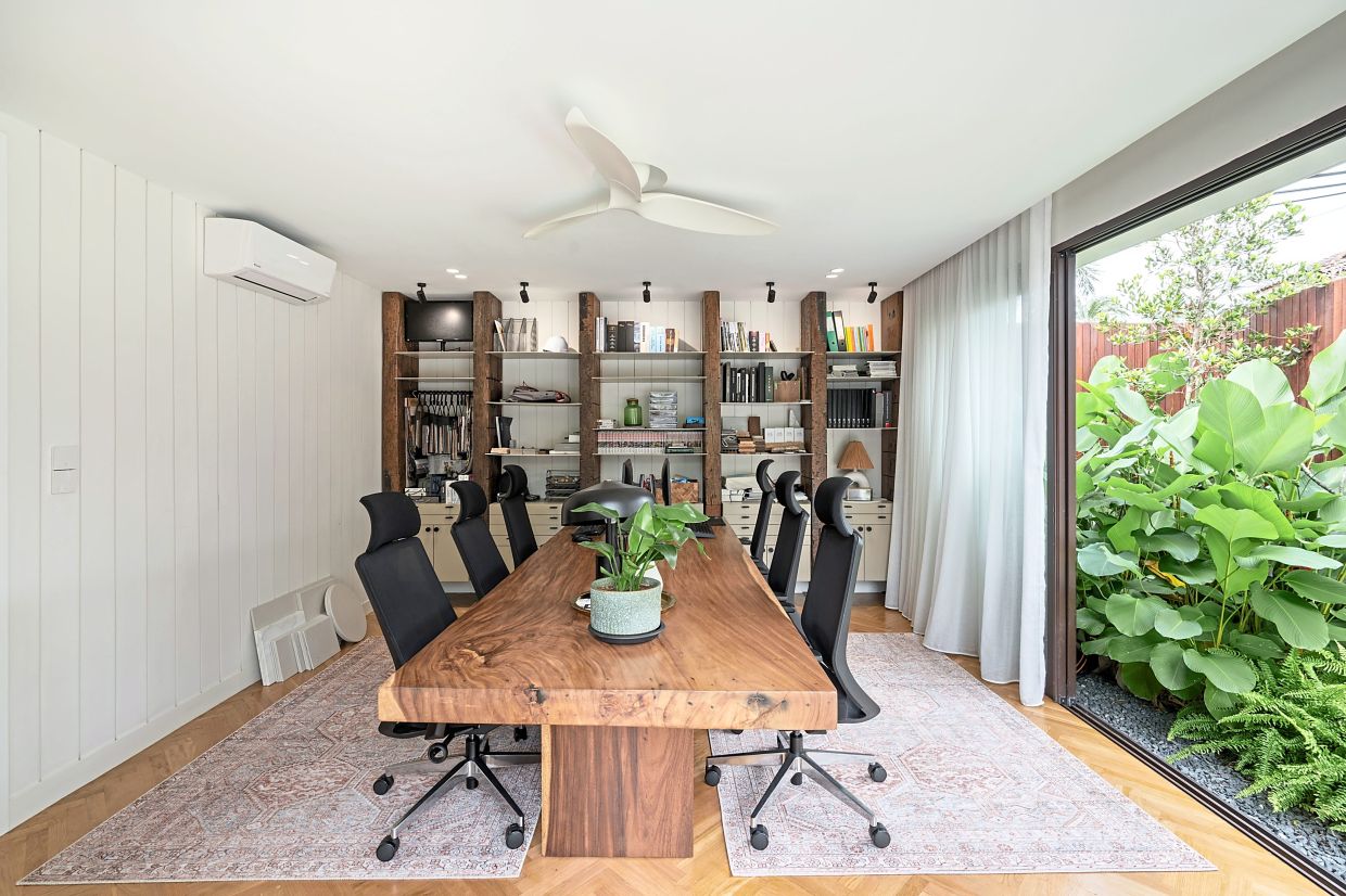
“Hence a playroom was required and positioned near the home office as we run a design studio from home, so we work hard and we parent hard,” said See.
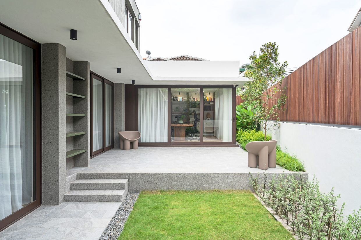
The home office was also designed to have its own access to ensure privacy in the main living areas.
“We also wanted the main door to be inconspicuous, with minimal windows at the front facade. This is because the front of the house is facing east where it catches the morning sun. The solid façade minimises the heat gain.
“Plus, the view at the front of the house isn’t great and since we have a little garden on the side (facing north), it made sense to direct our attention towards the side garden only,” said See.
They also did away with a car porch gate to maximise the parking space in order to comfortably fit four cars. Otherwise visitors would have to double park on the main road outside and inconvenience their neighbours, he added.
Due to the pandemic, the house was only completed November last year, although renovation work began in July 2020.
Naming their house Kami, See explained that it was common practice at their design studio Paperspace to give pet names to their projects, and it has always been a Malay word that signified the theme or concept of the project.
“In this case, this is a home specially crafted for Amy and me, and our beloved kids. Therefore it made sense to call this home Kami as it’s designed for us all,” said See.
With a land size of 3,067sq ft (285sq m) and a previous build-up area of 2,150sq ft (200sq m), Kami’s new build-up has stretched to 2,400sq ft (223sq m).
From four bedrooms before the renovation, the new living space contains three bedrooms, a kids’ playroom and a home office. It also has an open kitchen.
External aesthetics
Kami’s pitched roof is one of its more unique features.
“We always liked the gable roof profile so that was one of the aspects of the existing house we definitely wanted to change. The existing roof also had multiple pitches and we wanted to change it to one simple and clean profile to minimise the possibility of future leakages.
“We went with a metal roof for its minimalistic appearance and also to bust the stigma that metal roofs are noisy and absorb heat. We hope this encourages people to be more accepting of metal roofs for private residences.
“Amy is from Sabah and the façade is kind of a homage to the Rumah Panjang, a vernacular architecture house from Borneo,” said See.
Wood and rustic elements feature strongly in the exterior and interior.
“We love the rustic appearance of wood siding (material used to surface the exterior of a building to protect it against the elements and prevent heat loss), so we created vertical grooves on the external walls to replicate that look because real wood siding is not durable in our tropical weather.
“We went with textured paint on the external walls of the ground floor for its rusticity and low maintenance – no repainting or touch-ups needed over the years.”
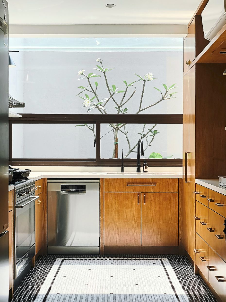
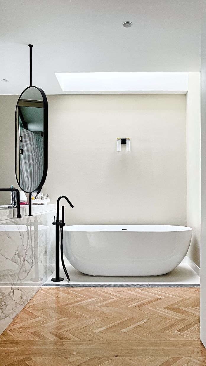
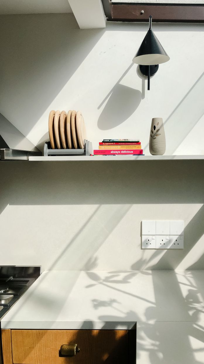
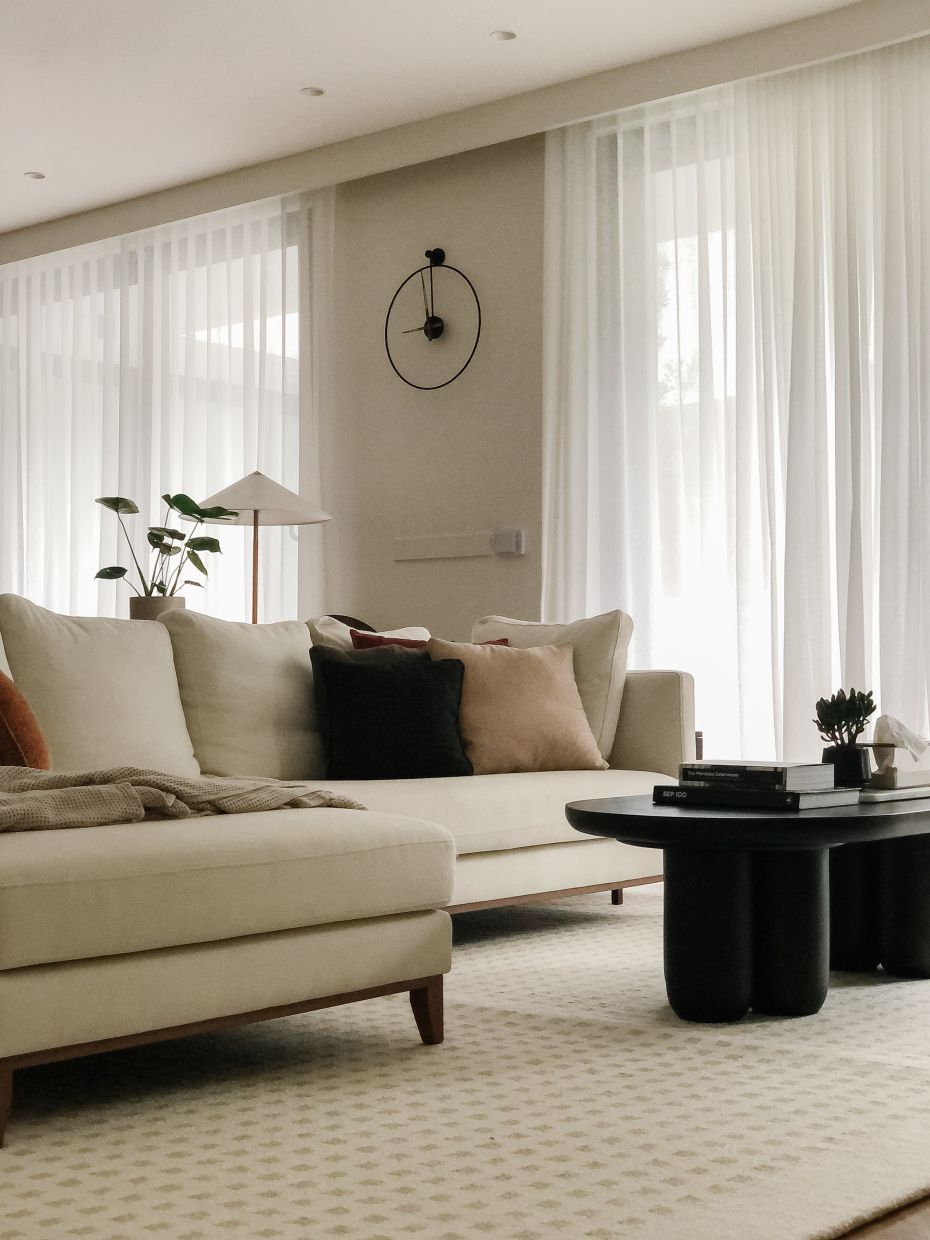
The interior of the house exudes a minimalist appeal – wood is paired with stainless steel, and furniture carefully selected to fit their needs.
“We love an open plan, which is why we have very minimal internal walls, especially on the ground floor. We went with solid wood flooring to give warmth to the space.
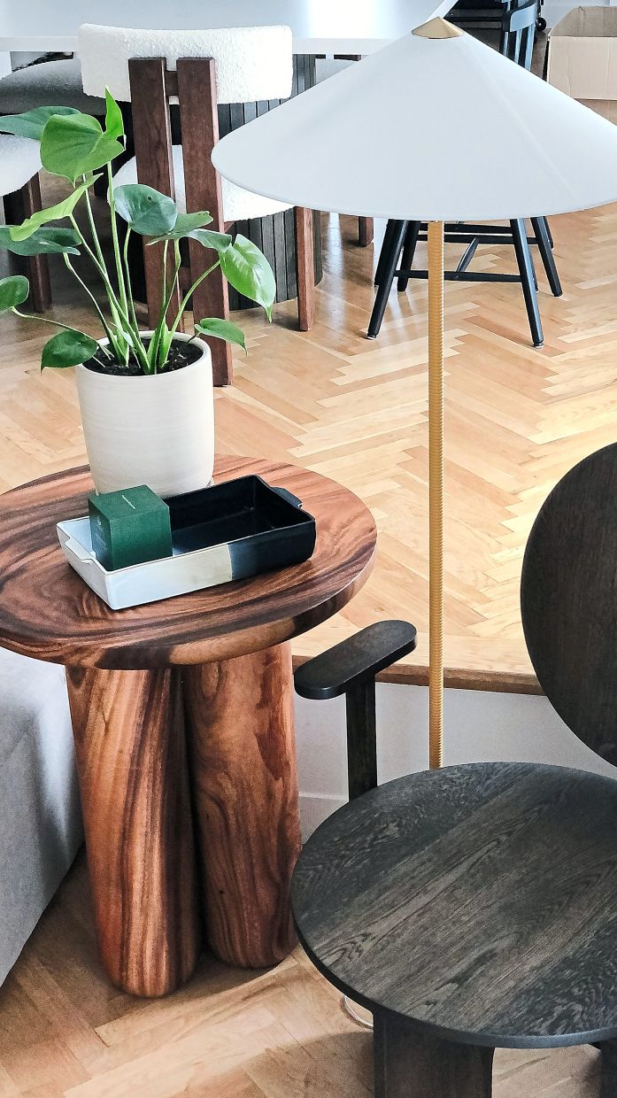
“We like playing with patterns and geometry, hence the choice for herringbone wood flooring and the different textures and patterned tiles in the bathrooms.
“The rustic element of the architecture continues throughout the interior design via curated and customised furniture, door hardware, and detailing,” added See.
The family’s laundry room is also “unconventionally” situated upstairs, near the bedrooms, something See says “is very uncommon yet so logical and convenient”.
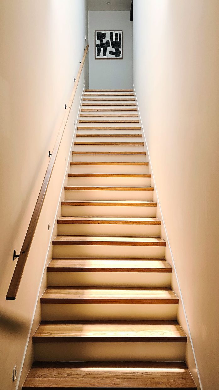
Meanwhile, a barn door located at the upper hallway, right after the staircase, adds a country feel to the space.
“We want to be able to close off the entire top floor at night, which is the purpose of the door. And we like incorporating bits of rustic elements in the house hence the choice of a barn door instead of a standard door.”
Meeting their needs
See explained that the focal point of the entire design has always been the courtyard garden.
“We wanted the house to orientate towards it as we have no views around us. Plus, security is a concern and we want a safe place for the kids to run around without being exposed to constantly passing cars.
“Inspired by resorts by Geoffrey Bawa (an influential Sri Lankan architect), the courtyard becomes a foyer space where we wear our shoes and store our umbrellas.
“In Malaysia, we always have a double-door system where we have a main timber door after a metal grille door. In our case, the ‘secret’ courtyard door is our grille door and the sliding glass door becomes our main door into the house.”
Tall fencing around the courtyard provides a contrasting atmosphere to the gateless car porch.
“It almost feels like stepping out of a busy urban setting into a quiet and tranquil garden with lush landscaping as we walk past the courtyard door.
“Naturally, we want the garden to have ample sunlight throughout the day, so we avoided building a two-storey home office to avoid a towering structure overlooking the courtyard. Instead, we opted for a roof terrace where we laid large amounts of loose rock (fragments) that serve as insulation because concrete roofs absorb heat quickly.
“The roof terrace becomes a private balcony to the guest bedroom. During festive seasons, we decorate the roof and it becomes a themed garden space to greet the guests as they walk through the courtyard door,” said See.
The couple also wanted two different landscape concepts – one that requires minimal maintenance which spreads across the car porch area before the courtyard entrance door, and another that they didn’t mind spending time to maintain as it provides a lot of benefits to the living space, which is what is seen in the courtyard.
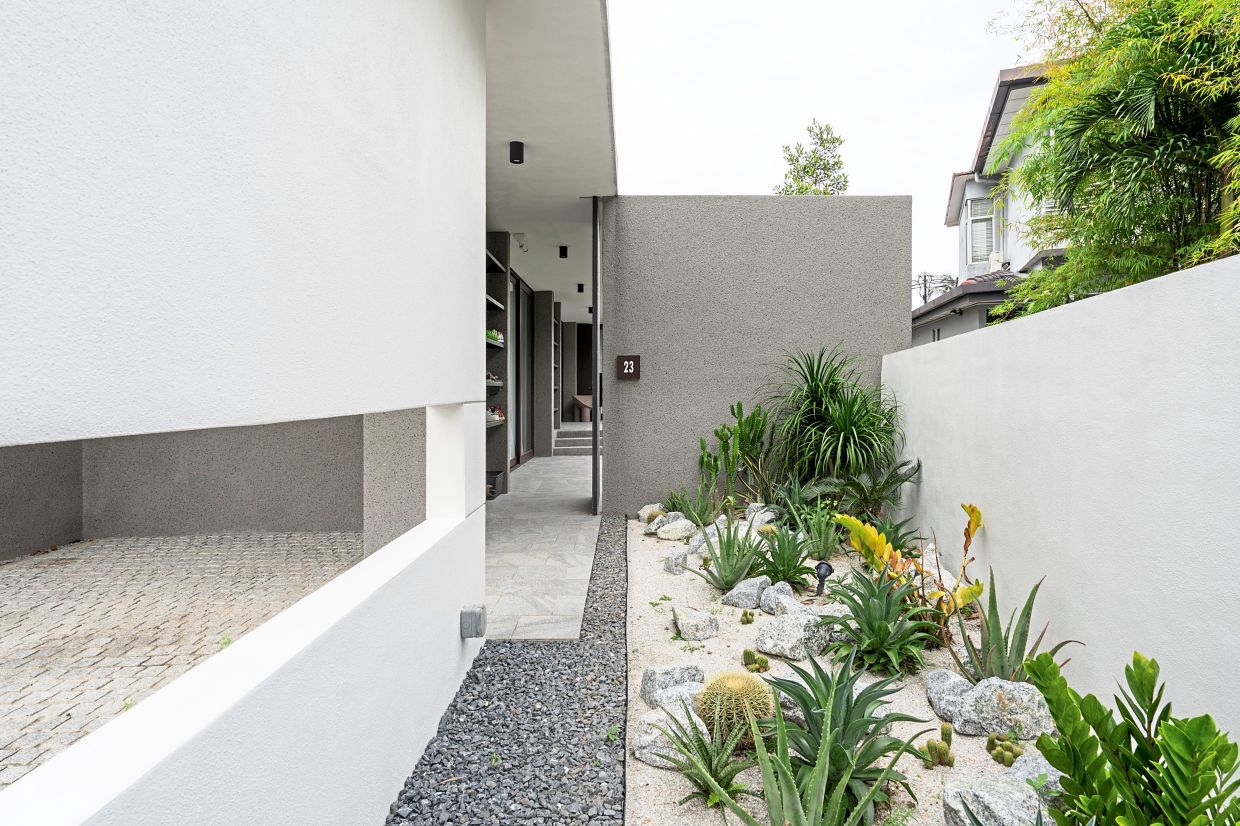
“Amy is not a fan of wild landscaping. She likes a minimalist garden where there aren’t many leaves or bushes. She was inspired by a picture of a dessert garden she stumbled upon online and wanted it for the front garden.
“We use a lot of tropical dry plants such as cactus, palm and aloe vera which we do not need to water constantly. The soil of the plants is pure sand to allow fast water discharge to the public drain to avoid drowning the dry plants, especially cactuses.
“The idea behind the courtyard’s softscaping is we wanted it to be lusher and greener. Therefore we planted Japanese grass (Zoysia japonica) and a mixture of flowering shrubs and trees such as murraya (jasmine), calathea, frangipani and tristania. These require some level of upkeep but the benefits outweigh the burden,” said See.
Overall, See and Ang also incorporated green design features into Kami, such as the way the house is orientated to minimise heat gain and maximise natural ventilation, leading to reduced air-conditioning usage and omitting the need for mechanical exhaust fans.
“The interior of the house is well lit throughout the day whereby we do not need compensation from artificial lights. Even when it comes to material selection, we utilise a lot of reclaimed wood recycled from old, weathered train tracks and bridges as racks, stairs and structural support,” he said.
The Kami house in Petaling Jaya stands out with its pitched roof design. Photos: Bricksbegin
The minimalist, low-maintenance garden is filled with tropical dry plants such as cactus, palm and aloe vera.
Photos: BricksBegin
The home office has a separate entrance and features a rooftop terrace that contains gravel for insulation and aesthetic purposes.
The home office looks out to the side garden and has a separate access to ensure privacy in the main living area.
Photo: BricksBegin


