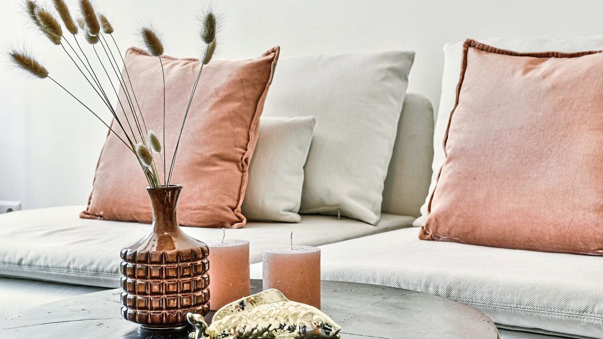
If you have a compact living room in your apartment, avoid a bulky sofa that will look out of proportion with the space. Photos: Canva
A fortnight ago, I shared the hot tip of amplifying your home interiors with mirrors. We saw how a singular strategy of mirror placement yields varying impacts in your design.
Today, we discuss the significance of scale and proportion in your home interiors. When was the last time you felt inspired and captivated while walking into an interior space?
On the other hand, when was the last time you felt claustrophobic, overwhelmed and uncomfortable in a space? The mystery behind such spaces lies in the powers of scale and proportion in interior design. By understanding these two design elements, you are able to decorate your home confidently.
Scale and proportion are often used interchangeably but each has distinct meanings in interior design. Scale refers to the size of an object against the size of the room, while proportion deals with how one object relates to other items within the same room.
Interesting? For example, when you fit a king-sized bed into a small study, we describe the scale of the bed as too big for the small room. When we select paintings to hang on an empty wall, we often go with paintings that are proportionate to the wall.
In this article, we share bite-size tips to help you navigate the world of DIY home design better.
Do you know that the proportion of ceiling height in relation to the floor area dictates how you feel in the room? Living and dining halls with tall ceilings tend to bring a welcoming and uplifting ambience. This is evident in hotel lobbies, posh restaurants and shopping malls.
On the other hand, if you design the same high ceiling for a small space like your bedroom, it creates a cold and formal ambience for a space where you wish to unwind and rest. Hence, it is critical that the ceiling height of each room is designed well in relation to the human scale and the desired function of the room.
One of the common mistakes made by homeowners is underestimating the importance of scale when choosing furniture for their home. If you have a compact living room in your apartment, opt for an L-shape sofa set that has a low backrest. Avoid a bulky sofa that will look out of proportion to the space. If your living room is wide and spacious, then pick sofa sets that come in 1+2+3 seaters that sit and cover the space well.
Hence, before you purchase that sofa that catches your eye, always cross check the measurements of the furniture against the size of the actual space. Once you achieve the balance in proportions, you’ll have a cosy and comfy space.
It is easy to assume that having more empty space in a home will make it feel more spacious. But, too much of a good thing can be a bad thing. In any home interior, be mindful of the negative space created by empty spaces between furniture pieces. A large bedroom will feel cold if there’s only a small desk and chair tucked at the corner. The key here is finding the right balance.
How do you curate the proportions of the various decor items and furniture in your home? Where do you even begin? Start by deciding which item should be the focal point of the space. For example, the round marble dining table can be the focal point of your dining area. A long rectangular table runner will not sit well on a round dining table.
Additionally, you may have a decorative pendant light above the dining table to enhance its prominence, followed with chairs and cutleries that hug around the central focal point. These examples illustrate the significance of curating items that are proportional to each other in the room.
As you would have gathered by now, the design process that we go through as architects and interior designers is never a one-dimensional linear process. There is never a clear-cut answer that we can copy and paste from one home to another. With so many design elements to choose and mix, the design process can be rather challenging and overwhelming for beginners. So be patient, take baby steps by first experimenting with small spaces.
To me, the fact that architecture and interior design can be such a complex form of art is the same reason that makes it so exciting and meaningful at the same time.
Join me in the next article, where I’ll share tips on how to use a Design Mood board as your springboard to curating your design concept. Happy designing!
Tan Bee Eu is a professional architect registered with Lembaga Arkitek Malaysia. She teaches at Universiti Sains Malaysia and has two decades of working experience involving diverse local and international projects in architecture and design. She can be reached at www.betadesignz.com/contact.


